Redesigning the FM contact us experience.
Introduction
FM's former contact experience tried to serve everyone at once. Existing clients, prospects, media inquiries, self-service, permits, catalog orders and more all funneled through the same nested dropdowns and convoluted flow.
In session recordings, you could watch users hit the experience and abandon the form. Every drop-off was someone who came to reach FM and left without getting through.
After the end-to-end redesign, FM's form submissions rose 453%.
Advocating for research
I'd been advocating for user research long before this project. It took time and effort to build the trust to make that happen.
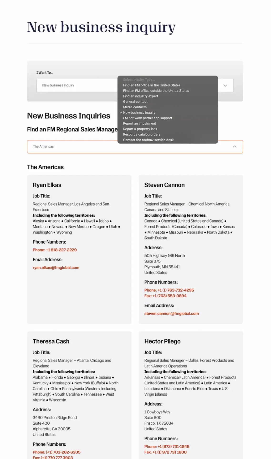
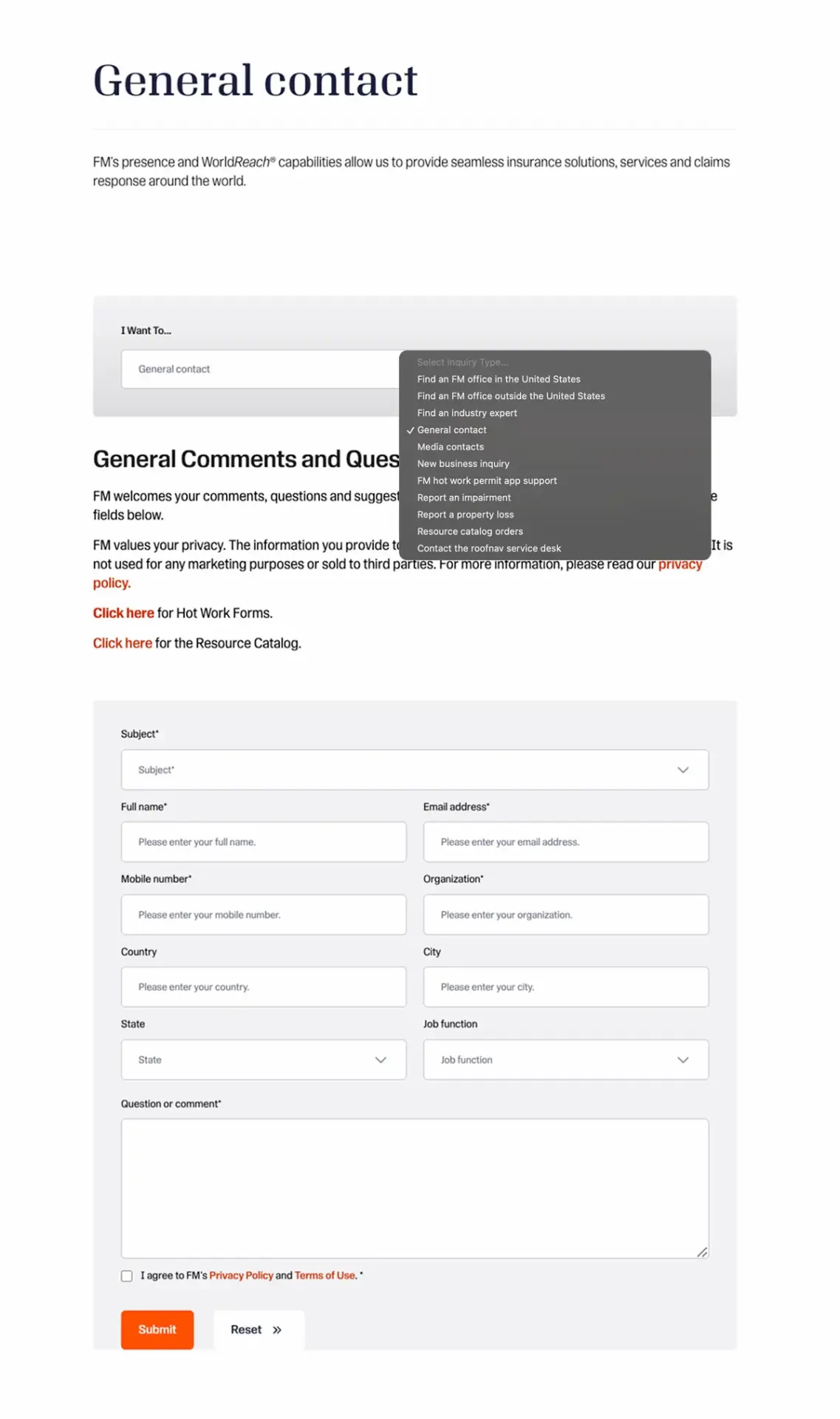
Before we achieved buy-in for discoverability sessions and user testing, we conducted an internal workshop to understand what stakeholders within the organization were looking to get out of the experience.
We then quickly built a prototype to play out the approach:
Some of the questions we raised to challenge the approach and expose the lack of data:
Findability
- Can users find the contact experience in the first place?
Audience
- Users self-identify once they arrive but that assumes we already know who's arriving. Are existing clients or technical audiences clicking Contact in the first place?
- Are the self-identification categories easily understood, and if so, why do we need "I'm not sure / other"?
- What is the primary outcome a user is looking to achieve when they click Contact and is that outcome hard to navigate?
Scope
Do users intuitively navigate to Contact for:
- Resource catalogs
- Claims and impairments
- Global portal
- Media inquiries
- Career information
- FM-approved roofing products information
- Hot works permits
- Industry experts
Or do users expect to find this information elsewhere? Are we adding unnecessary complexity that detracts from primary user intent?
None of it could be answered with data. That's what finally opened the door to real user sessions.
Into the sessions
I worked with Maureen McLennon, our Principle Experience Design Researcher, to plan the sessions and moderation guides. We aimed for five prospects and five existing clients. We got three existing clients, but no prospects. Each session was about 60 minutes one-on-one.
We split each session into two phases:
Phase 1, Discoverability: answering open-ended questions to better understand who actually arrives, what they're trying to accomplish and whether the experience meets that intent.
Phase 2, Usability: users completed tasks on a working prototype while thinking aloud. We observed where they expected to find information and asked follow-up questions to understand their reasoning.
What we learned
Contact isn't a destination for existing clients.
They call their FM contact.
“When you say 'Contact Us,' normally I would think that is [for] new business inquiry.”
Participant Three
“I would call my existing FM people and [ask] my question.”
Participant One
Users don't expect to self-serve in the contact experience.
All three participants were surprised to find that self-service options such as report a loss, report an impairment, and the FM Portal lived within the contact experience.
“Some of these [self-service options], it seems like an odd place for it to be. It would’ve taken me a minute to find this.”
Participant 3
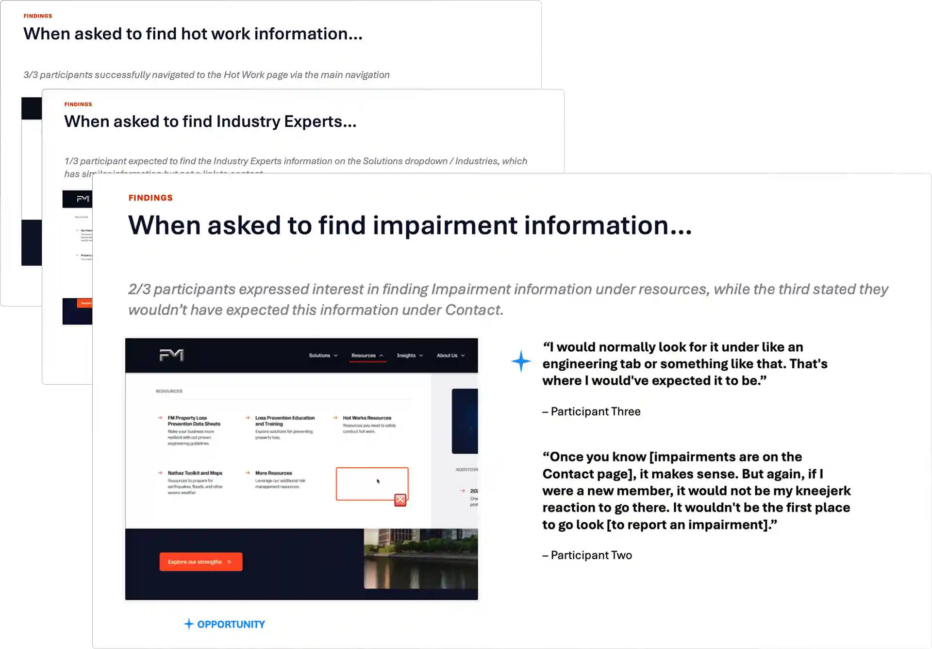
Users did not expect to find resources under contact.
They looked for hot work resources, impairment reporting, and industry experts where those topics actually live on the site and not in Contact.
Office locations weren't relevant to participants.
All participants expressed a disinterest in finding FM office information.
"Where the offices are doesn't really matter, because most of the in-person meetings are at my locations. There's no reason for me to go there."
Participant Three
A form is a last resort.
Participants agreed that if they didn't have their direct contacts within FM already established, then they would prefer to call a general number on FM.com than fill out a form.
From insight to design decisions
First, we recognized the real audience was prospects rather than existing clients. The experience needed to focus on acquisition to align with user needs and business goals.
However, the organization was unable to source prospective clients for research needs. Therefore, we had to base our decisions on the evidence we did have from existing clients.
Findability
We validated the decision to add contact to the primary navigation. Previously, it only lived in the footer. Every participant used it to reach the contact experience. When we presented the findings, stakeholders agreed client acquisition was the primary goal of the experience. Placing contact in the navigation gave that goal the visibility it needed.

Simplification
I needed to focus the experience to serve the needs of a prospective client audience. I started by finding what didn't.
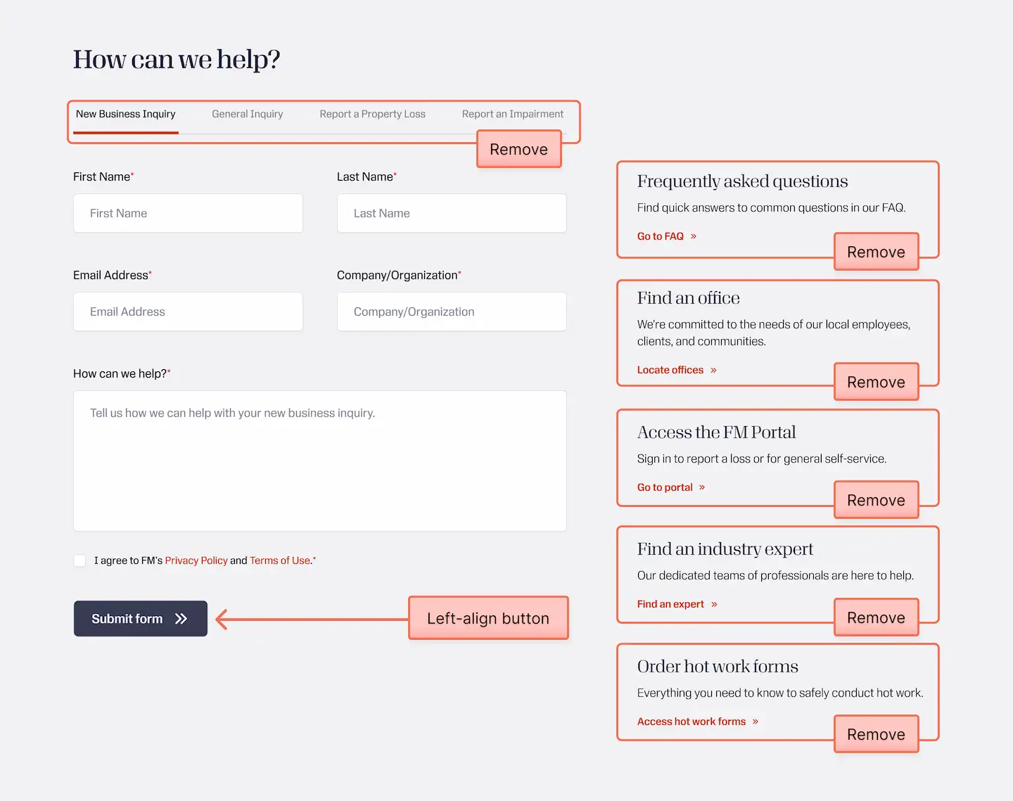
Tab row

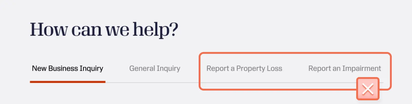
New Business Inquiry versus General Inquiry was just a soft way to make users self-identify. Additionally, choosing an inquiry type put the burden on the user so the business could prioritize outreach. That burden belongs with the business, not the user.
I also identified Report a Property Loss and Report an Impairment tabs for removal. These options are specific towards existing clients and only detract from primary user intent.
Removing the row entirely eliminates a cognitive step in which users have to decide which tab applies to them before they can even begin. Without that decision in the way, the experience serves their primary intent without interruption.
FAQ:
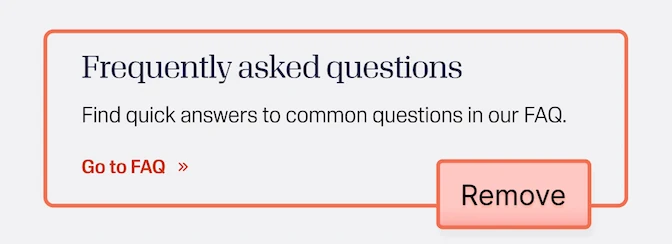
An FAQ only helps if it answers real questions. I felt strongly we shouldn't offer an FAQ until we better understood what questions prospective clients actually needed answered.
Find an office
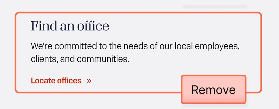
Office locations weren't relevant to existing clients but perhaps they could be for prospects. When I asked stakeholders how a prospective client would actually use an office location, no one could give a convincing answer. Realistically, we had no insight into whether prospects needed this information at all.
There was also a practical problem. Each location's phone number rang its front desk, usually a security guard who couldn't effectively route calls. So we recommended omitting office locations until we could research further.
FM Portal, industry experts, hot work resources
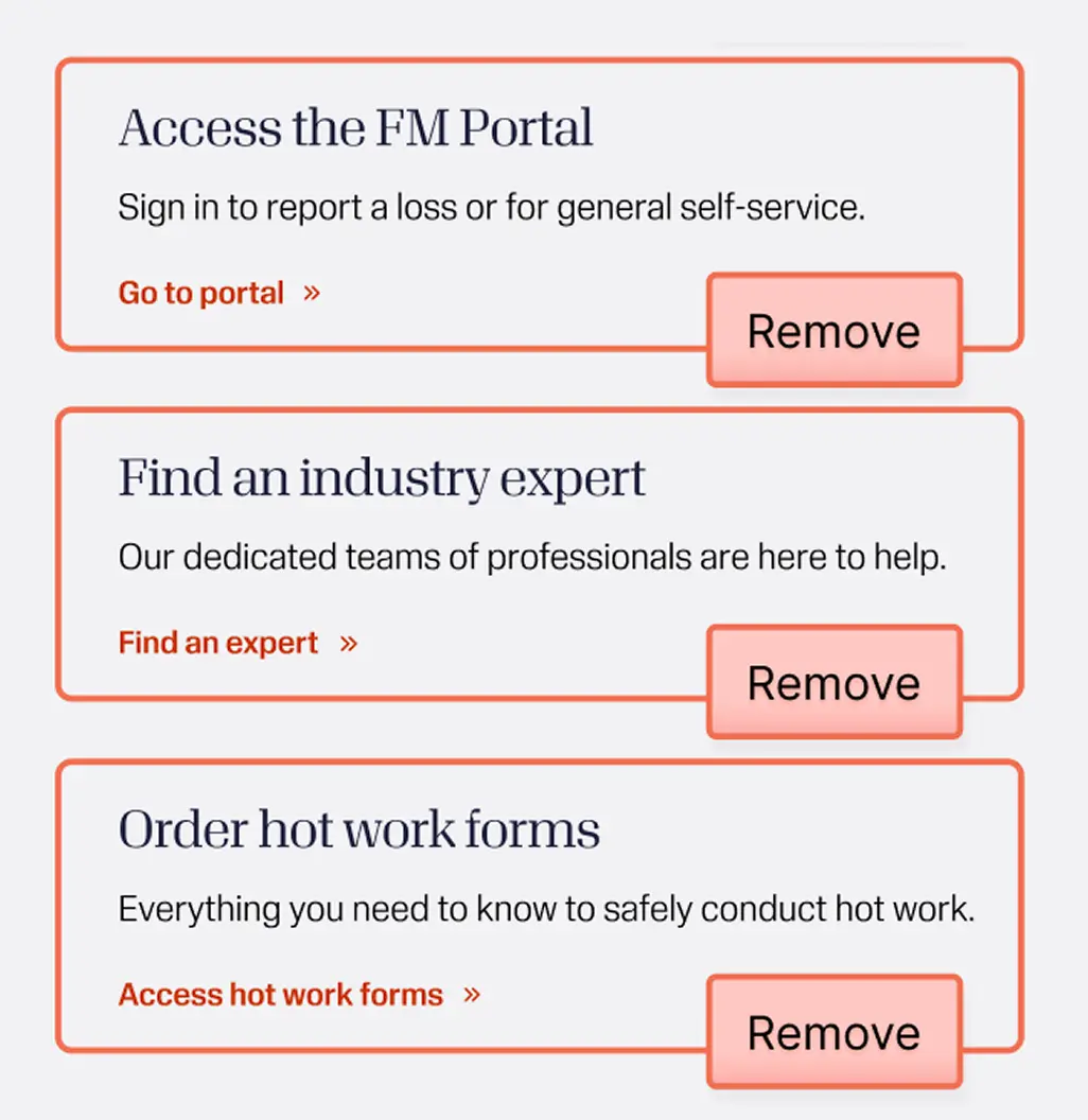
The FM Portal was easily identified as an item that did not belong as it falls under self-service for existing users.
The inclusion of resources such as hot work forms and FM-approved roofing products was jarring for all participants and therefore excluded from the experience.
Lastly, items such as careers and media inquiries were moved to the footer as they serve a different audience. More research would be needed to test their placement.
Outcome
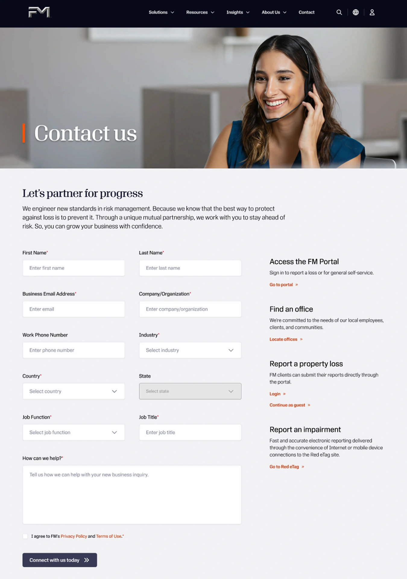
I made my recommendations but shipping is a negotiation. Stakeholders were adamant about keeping several self-service options and "Find an office." They asked for six more fields and an extra checkbox was added post-delivery.
Those additions work against the research. I'd still make the case to cut or defer them. The shipped form is a real improvement on what it replaced. It's just busier than the one I championed for.
The topline held up. Form submissions rose 453% across the same five-month window, from 507 to 2,805 (August to December, 2024 versus 2025).
Final thoughts
1. Design is advocacy.
The hardest part was getting the organization to agree to research at all. The first prototype was built on nothing but the business's needs and assumptions. Seeing it made the questions no one could answer impossible to ignore and that finally opened the door to real users.
Often, the most important part of the job often has nothing to do with your tools. It happens in the room by earning the trust to do the work right.
2. The evidence was incomplete.
The redesign pivoted on prospects being the real audience but we weren't able to sit down with them. Talking to prospects directly would have shown us what they actually needed from the experience. That insight would have sharpened the design and better served the business.
Furthermore, I would have preferred to have five or six participants in the study. Small sample sizes can lead to false signals and I would have been more comfortable making decisions with higher confidence.
3. Shipping is a negotiation.
I made the case for a leaner experience and didn't win all of it. The shipped form still carries fields and features I would have cut. That isn't a failure of the research, it's the reality of designing inside an organization. What shipped wasn't my ideal, but it was a real improvement.
4. Opportunity beyond the form.
Participants told us they'd rather call a general FM number than fill out a form. Competitive research pointed the same way: the strongest players offer several paths to conversion. FM.com offered a single path, the form, and a response could take weeks.
I advocated for multiple conversion paths: a general phone number, a request-a-quote option, a direct line between brokers and underwriters. However, building those paths required infrastructure the organization wasn't ready to invest in yet.
Experience design isn't confined to the artifact in front of us. It's every point where a person meets the brand.
Scott Glasser
Senior Product Designer, FM
Next project
WDS Design System →